
Visualizing Statewide Trips: Tools to Leverage GPS Data in Transportation Planning
The University of Utah has a new data visualization service to offer to state DOTs and other agencies. Using Small Starts funding from the National Institute for Transportation and Communities (NITC), researcher Nikola Markovic and his team have developed a suite of visual analysis tools to demonstrate how GPS trajectory data can help accurately model and analyze mobility trends. These data are typically purchased from vendors, which means that transportation agencies must first understand the benefits before they decide to invest in data acquisition.
To help agencies see that value, the research team purchased one month of Utah trajectory data, which included detailed information about 2.5 million trips that took place in September 2018. The researchers cleaned up and matched the 12 MB of data with the state road network. Next, they evaluated the data's spatial/temporal coverage and compared it with ground-truth information from 400 point detectors across Utah. This revealed that the statewide GPS data had very good spatial coverage and a capture rate of about 2.8%, which implies that the acquired trajectory data capture one in every 50 trips in Utah.
EXPLORE THE INTERACTIVE VISUAL ANALYSIS TOOLS
The researchers created several visual analysis tools for the Utah GPS data, which are represented through interactive online animations. These data visualizations highlight the usefulness and value of GPS trajectory data in transportation planning and performance measurement. The interactive animations were created by Seth Miller, a graduate assistant in civil and environmental engineering at the University of Utah.
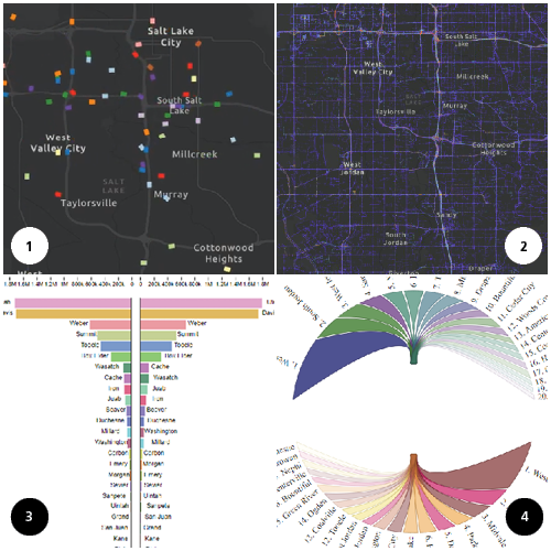
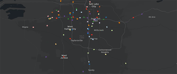
First, the team developed an animation that plots trips recorded during a 30-minute interval in the Salt Lake City metropolitan area. This video enables practitioners to understand that data and sample size.
2) Utah Variable Traffic Density Heatmap
Additional insight into data coverage is provided by a heat map of Utah's variable traffic density. This map shows the density of over 900 million waypoints (i.e., vehicle GPS locations) that were recorded over the observed one-month period for which trajectory data were purchased. The colors change from dark to light as densities increase. Densities for different time points can be explored by dragging the button below the video.
3) Trips Between Counties, Chord Diagram
Exploration of trip origin-destination patterns is crucial to applications related to transportation planning. To demonstrate simple use of trajectory data to this end, the team developed interactive chord diagrams to enable transportation agencies to easily explore trip patterns between counties in Utah. By clicking on a specific county, the animation will emphasize trips between the selected county and the remaining counties.
4) Trips Entering and Exiting Salt Lake City
The above chord diagrams provide good insights into travel patterns between multiple selected geographies. However, the main downside is that chords show trips taking place in both directions. In order to facilitate directional exploration of trips, another animation was developed to show trips both starting and ending in the selected geographic region. This visualization shows the trip counts that start or end in Salt Lake City in a single hour. The top shows trips originating from Salt Lake City and ending elsewhere and the bottom shows the trips originating from elsewhere and ending in Salt Lake City. To change the day of the week, click the days on the timeline.
The results of these analyses can help transportation agencies to better understand the value of this type of mobility data in transportation system analyses. By leading in the deployment of innovative practices and technologies like this, planners and DOTs can improve the safety and performance of the nation’s transportation system.
NITC WEBINAR ON APRIL 7, 2020
Before joining the University of Utah, Nikola Markovic worked at the Center for Advanced Transportation Technology (CATT) at the University of Maryland. Mark Franz of the CATT Lab will join Dr. Markovic for a NITC webinar to demonstrate CATT Lab's visual analytics that enables transportation agencies to easily explore terabytes of GPS trajectory data, and talk about the experiences of DOTs that have recently started to leverage this type of data. See the demo and learn more on our April 7th webinar Visual Exploration of Trajectory Data.
This research was funded by the National Institute for Transportation and Communities, with additional support from the University of Utah.
RELATED RESEARCH
To learn more about this and other NITC research, sign up for our monthly research newsletter.
- Overcoming Barriers for the Wide-scale Adoption of Standardized Real-time Transit Information
- Social-Transportation Analytic Toolbox (STAT) for Transit Networks
- Vehicle Sensor Data Based Traffic Control in Connected Automated Vehicle Environment
The National Institute for Transportation and Communities (NITC) is one of seven U.S. Department of Transportation national university transportation centers. NITC is a program of the Transportation Research and Education Center (TREC) at Portland State University. This PSU-led research partnership also includes the Oregon Institute of Technology, University of Arizona, University of Oregon, University of Texas at Arlington and University of Utah. We pursue our theme — improving mobility of people and goods to build strong communities — through research, education and technology transfer.